Client: Disney Parks
My Role: Art direction and design for brand identity and style
Rebranding a valuable and loved program
The panel is a very popular tool for vacationers planning their trip to the parks. It lets them ask questions and find answers from parks experts.
I have omitted and obfuscated confidential information in this case study. The information in this case study is my own and does not reflect the views of Disney.
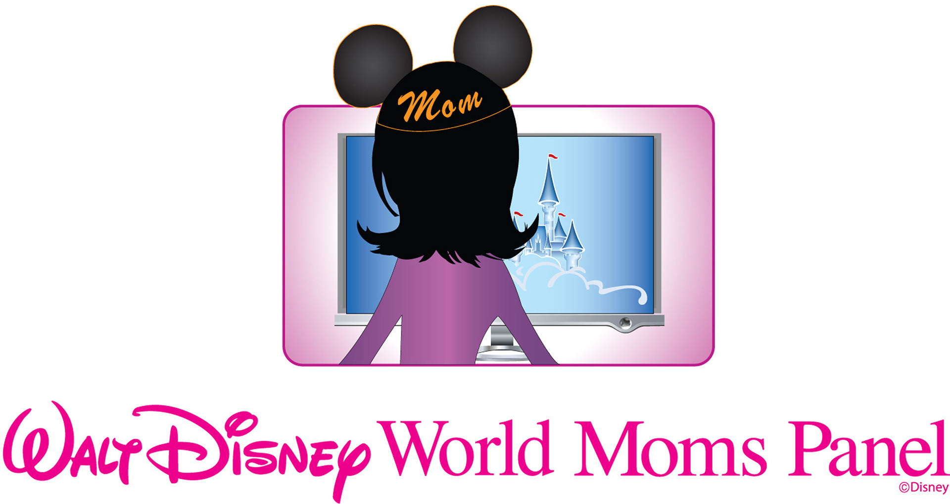

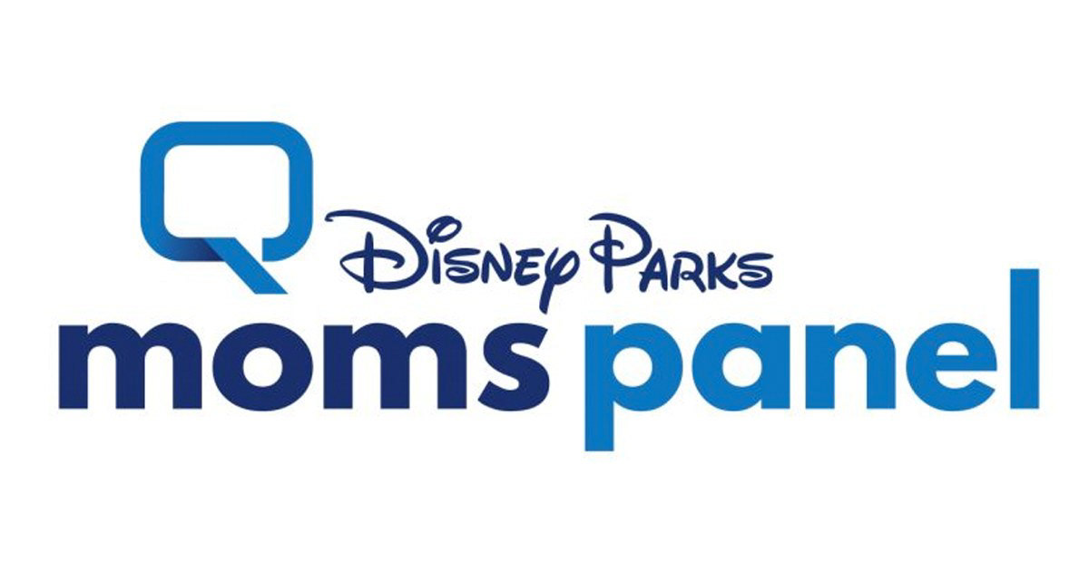
The Program's Past Branding
The Ask
The ask was to rename and rebrand the panel so all people of different ages, genders, and life roles knew they would get the help they needed when planning their vacation. The current name (Disney Parks Moms Panel) didn't feel inclusive and could easily seem like a resource only for mothers with kids.
The Challenge
We needed to create a new name, identity and design system that:
• Communicates expertise and relatability
• Makes users feel confident they’ll be getting useful and candid information
• Be helpful, reliable, trustworthy, authentic, not corporate
• Suggest user will be less overwhelmed — at ease, directed, and well-informed — familiar, in control
• Users will feel trust in people providing the information
• Lives within the Disney Brand
Unfortunately we were not given a master brand guide to help direct our work. We needed to conduct a large amount of research on Disney and Disney Parks materials to insure whatever we created still felt very much a part of the Disney brand.
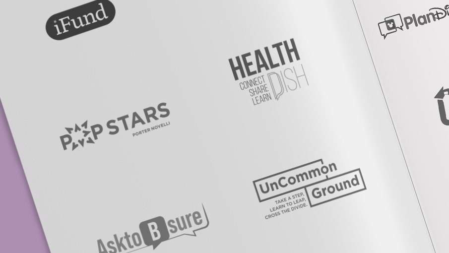
Sampling of Initial Designs
Designs explored: own-able Disney objects that denote wisdom, marks that represent location, symbols of excitement, symbols of communication, and symbols of planning.
Additional Challenge
While providing names for the panel, we wanted to show the proposed name and how it would look as a pictorial, or combination mark, or even perhaps use a mascot since this brand has so many great characters. This meant designing close to one hundred different logo types. At times I brought freelancers on to help bring a different perspective and approach to the proposed identities.
Discovery and Next Steps
The process took over a year. During that time we tested many names, logos, and color palettes against the criteria outlined above. Plan Disney resonated best when testing the names with a global audience. Audiences also gravitated towards logo marks that were close to the current panel's logo. Seeing that there is brand recognition we could pull from, I went back and worked with the clients to produce a mark that felt close to what already existed and showed a shared conversation with Disney at the heart of it.
Building out the Brand
While still in the review process I provided the client with a brand guide to show how the identity can work across applications.
Conclusion
The start of COVID-19 occurred during the approval phase of this project. The project was brought in-house and modified by the in-house team. The version of the logo and brand guidelines above are what was created and provided by me before hand-off to client.
